ZeroMark
The AI targeting layer for intelligent defense.
NarrativeIdentityVisualsWebsite
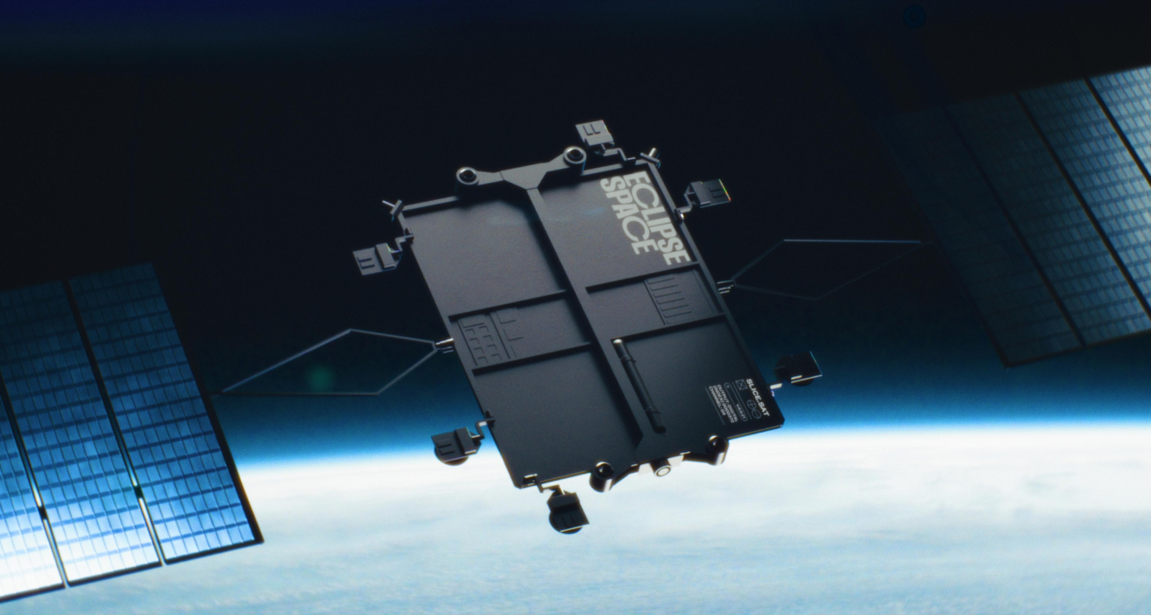
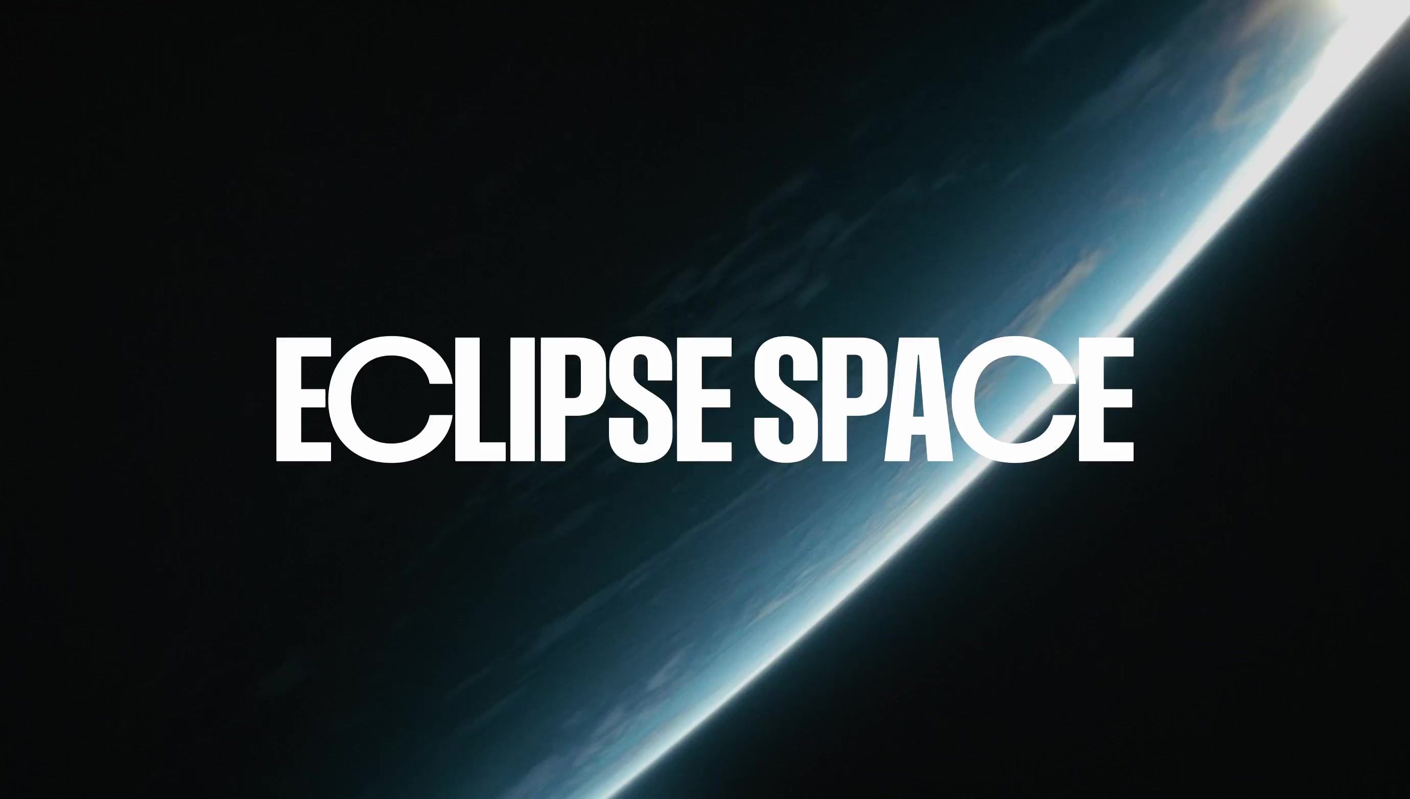
Eclipse Space designs and builds satellite constellations you own outright. Independent space infrastructure for nations, telcos and operators who would rather not rent their future from somebody else. When we met, all of it was real already: the business, the product, the customers, the manufacturing, the engineering. The brand was the one thing that didn’t exist, yet.
Industry
Space
Deliverables
Brand Strategy, Visual Identity, Website, 3D Visuals, Pitch Deck, Explainer Film
The Challenge
Branding a company that’s a heavyweight before the world has even heard of it. Eclipse was in stealth. Behind that silence sat a team with serious flight heritage, people who had designed, scaled and deployed megaconstellations before, and who were now doing it again for customers who wanted to keep what they paid for. So this was never about inventing a brand. It was about letting an incumbent-in-waiting finally look and sound like one, in time for a raise and a hiring push. Nothing to prove, but a lot to say.
The Bet
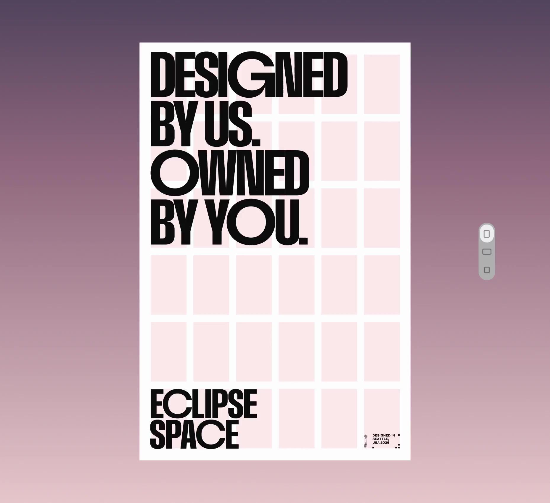
Eclipse already had the sharper idea: the age of shared megaconstellations giving way to one where each customer owns their own. Countries pay to own their water and their power, the argument went, and then rent the thing all of it now runs on. They called it sovereignty. We kept the thinking and changed the word. Sovereign is having its moment in tech right now, which is the problem, because moments end. Own is plainer, older, and happens to be what the product does. A conviction, Own your own future. A positioning, Independent space infrastructure. Designed by us. Owned by you.

The Look
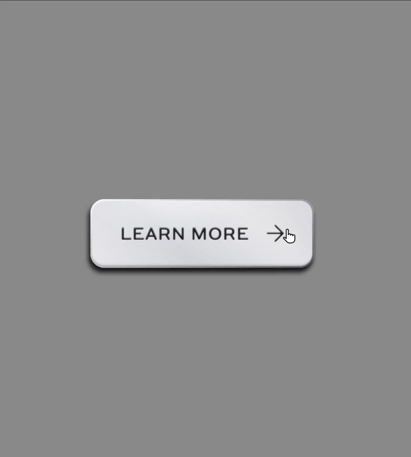
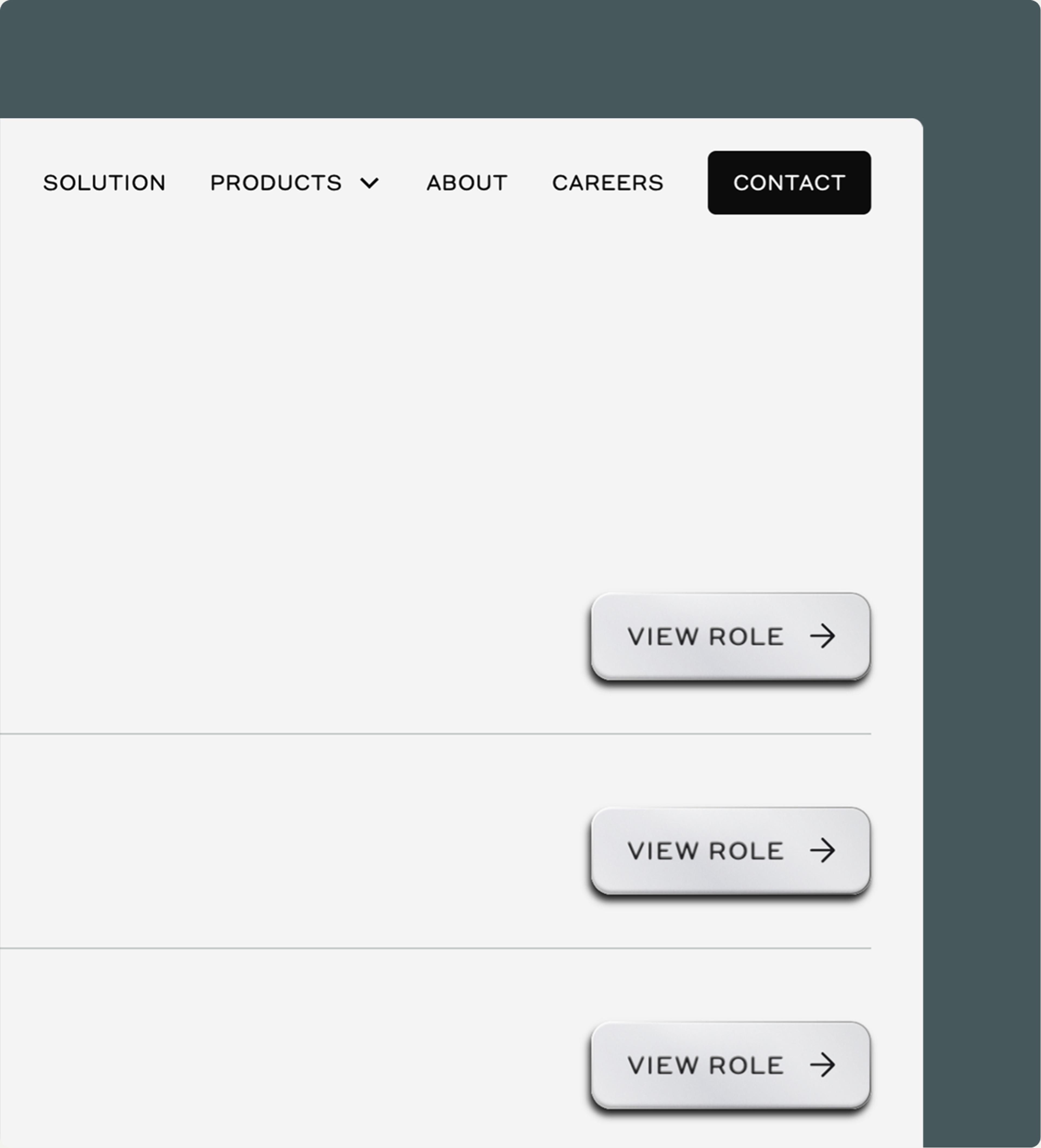
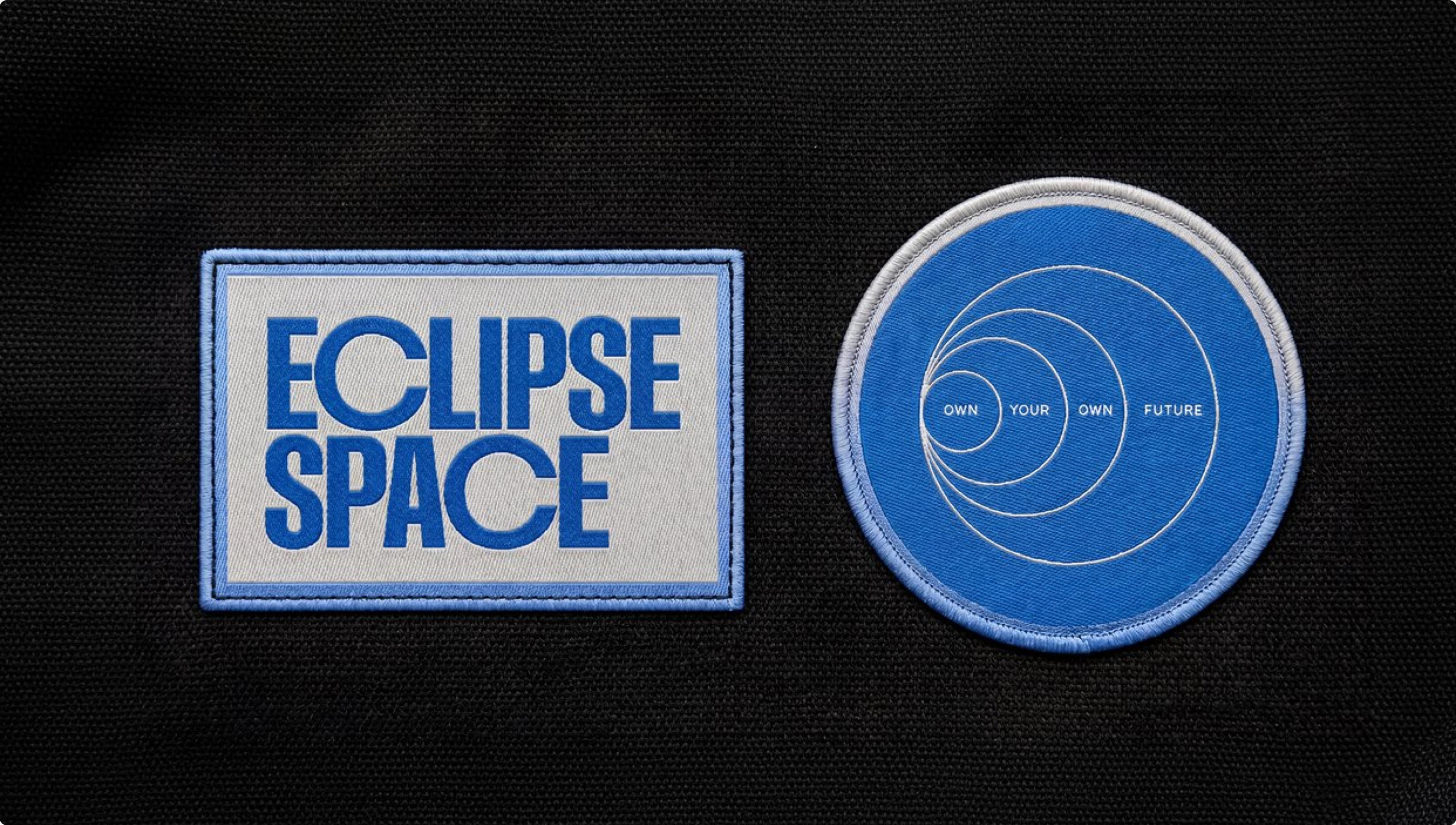
Buttons
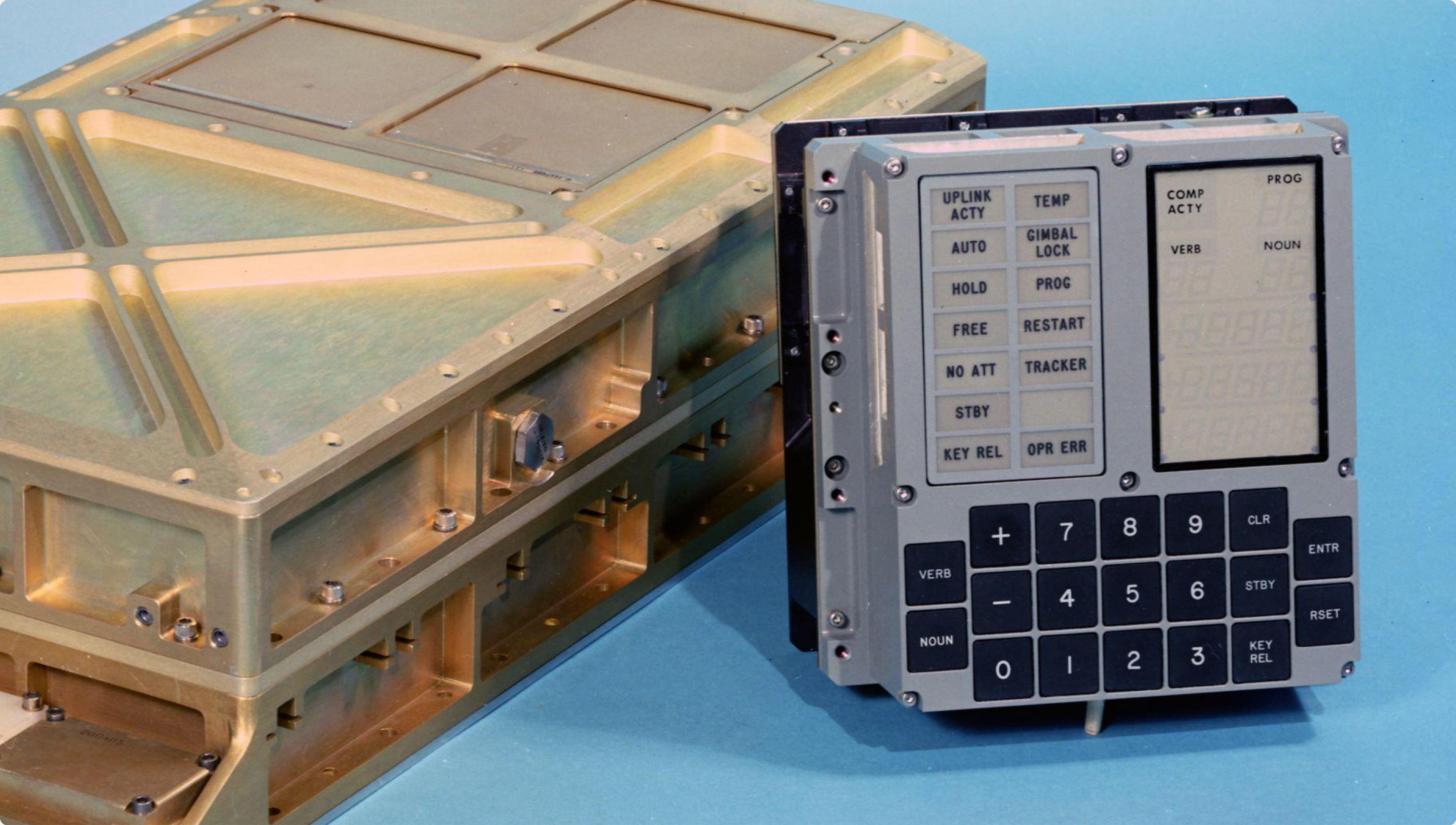
Maybe not the most obvious choice to begin, but sometimes creative work takes strange turns. When we began the project we had really snowed in on researching old Apollo hardware and software (and by we, we mean Carl). The Apollo program is something we often go back and refer to at Omoi because the parallels between it and what our clients do are often striking. Most of the things that were needed for the Apollo program didn’t exist. So they invented it. They built it for the very first time, thanks to a lot of effort and human ingenuity. And it took us to the moon. One of the things they needed was a computer. A computer that could help with guidance and navigation of a spacecraft. If you look at it today, it hardly resembles a computer. Alarm keypads look more advanced today. Yet every detail about it was carefully thought out.
Type
While much of the interfaces onboard Apollo used Futura, the Apollo Guidance Computer used Gorton, a once-ubiquitous functional font that has since been mostly forgotten. We wanted to pay a small homage to this computer, so we researched which font today was the best version of it, and found Gorton Perfected. It roots the system in real engineering and does the work in micrographics, labels and UI. From there we built up the rest of the type identity.
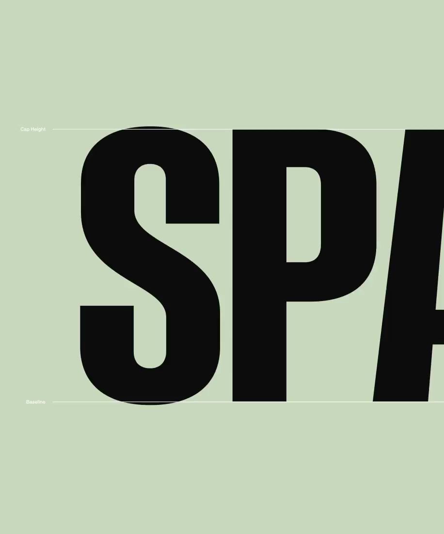
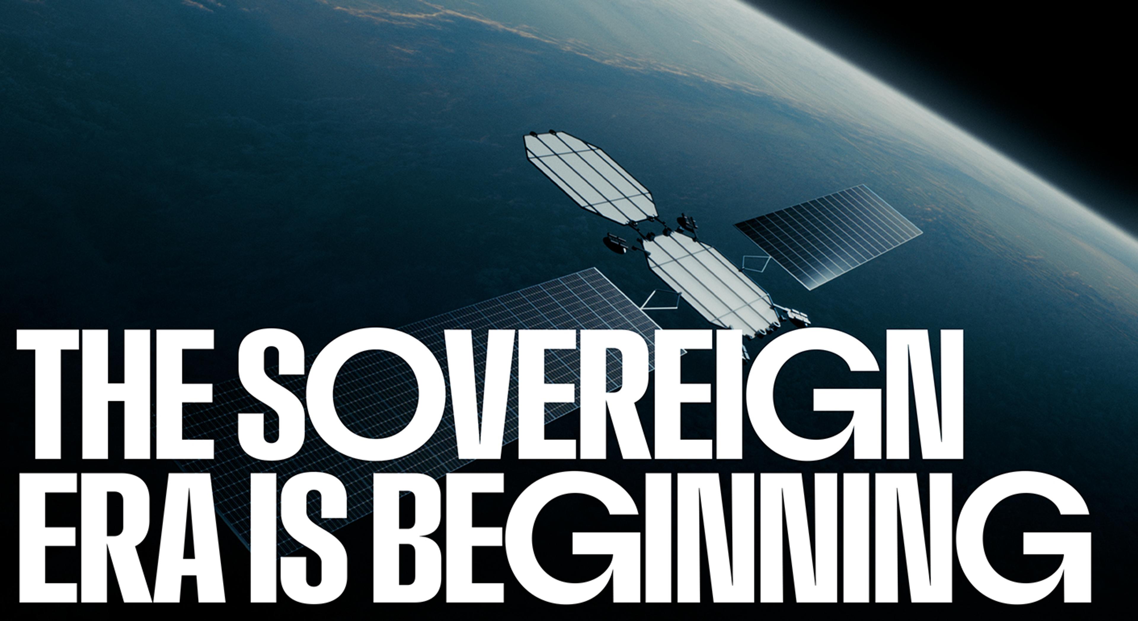
GT Mechanik Poly from Grilli Type carries headlines and body copy, and keeps the whole thing readable at the length a technical company actually writes at. Above both sits Eclipse Space Display, a customization for Eclipse by Blaze Type. Condensed letters against geometric round forms, the contrast pulled from Futura, the official typeface of the Apollo program, with custom extended Cs, Gs, Os, and Qs for maximum impact.
Color
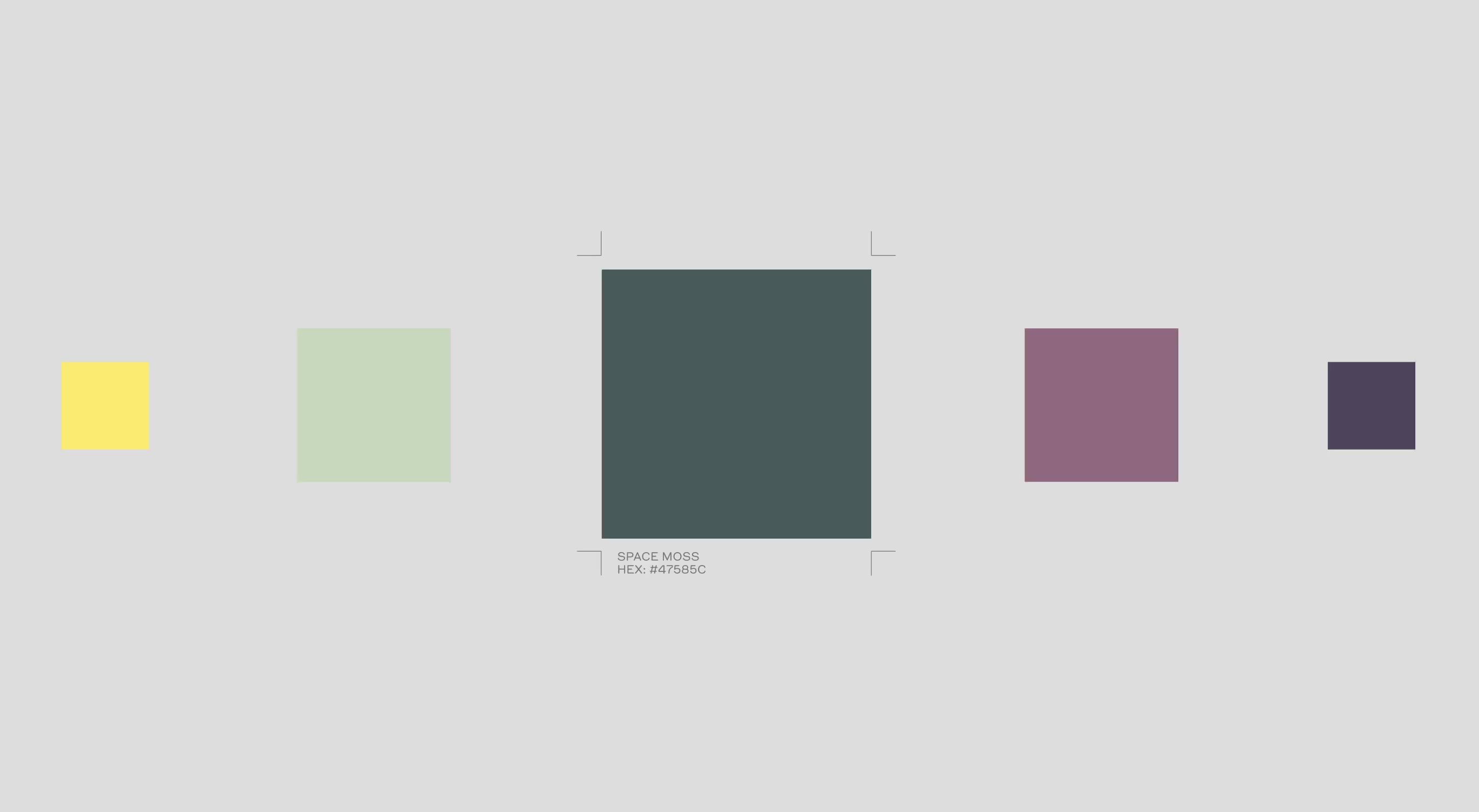
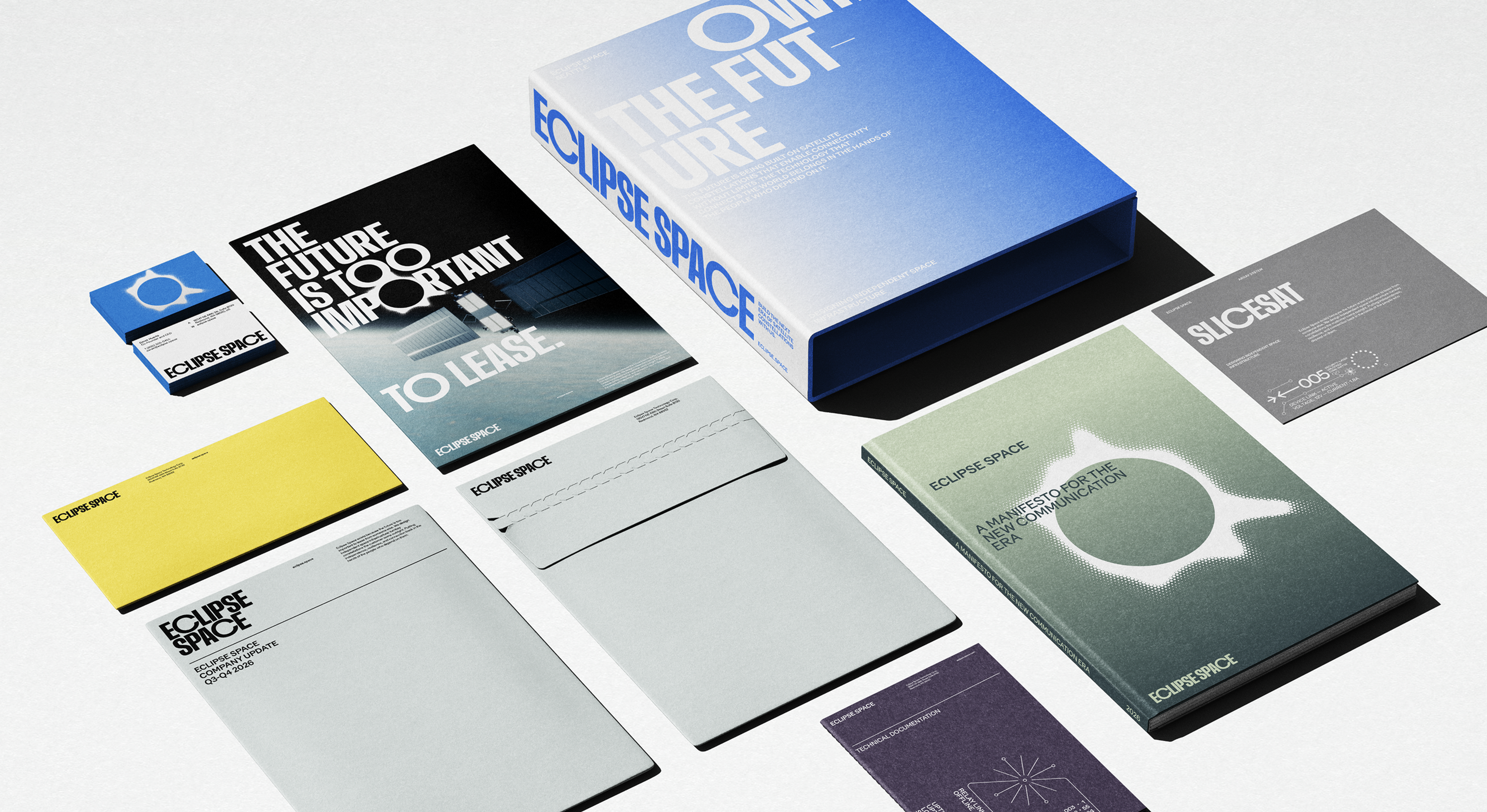
A burnt Space Orange and a bright Space Yellow for mid-century optimism. A Space Blue for low Earth orbit, which is to say the sky, to the rest of us. Around them sits a quieter set, mint, moss, plum, dusk and stone, and eight gradients built from the same colors.
Symbol
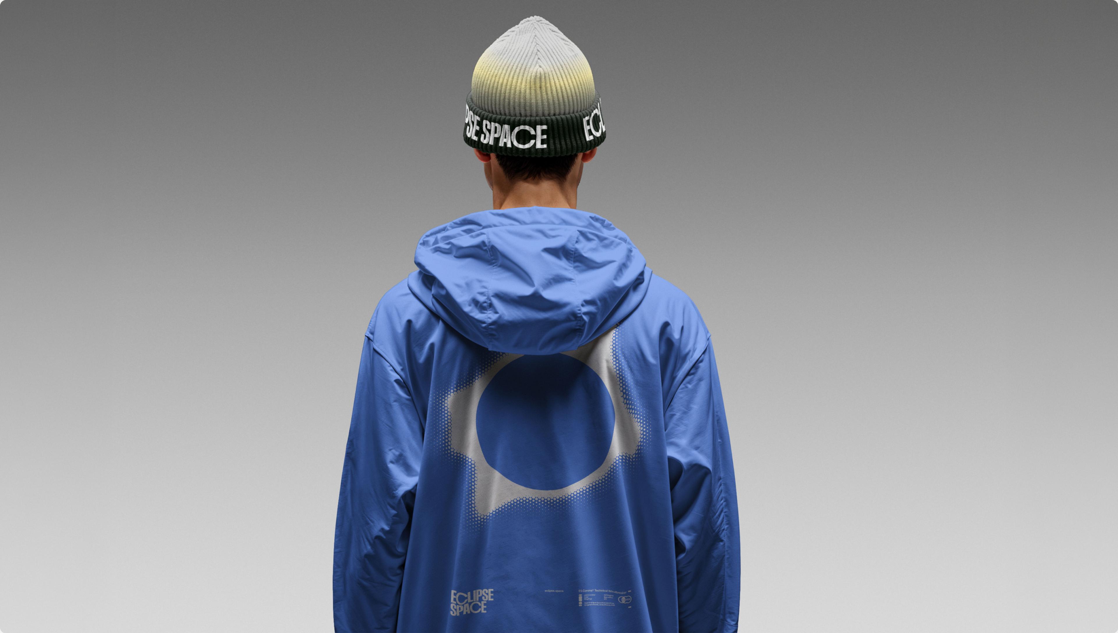
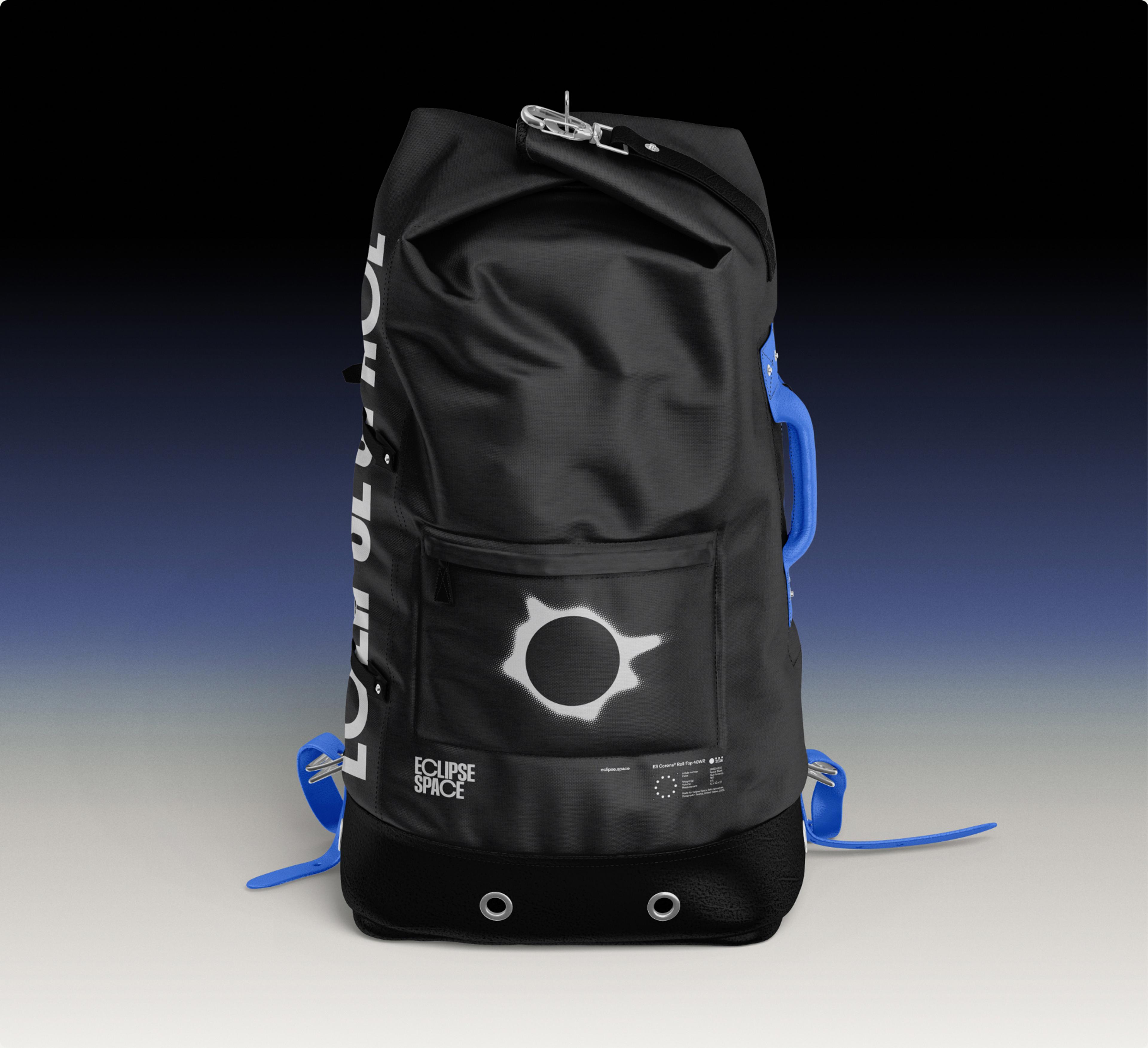
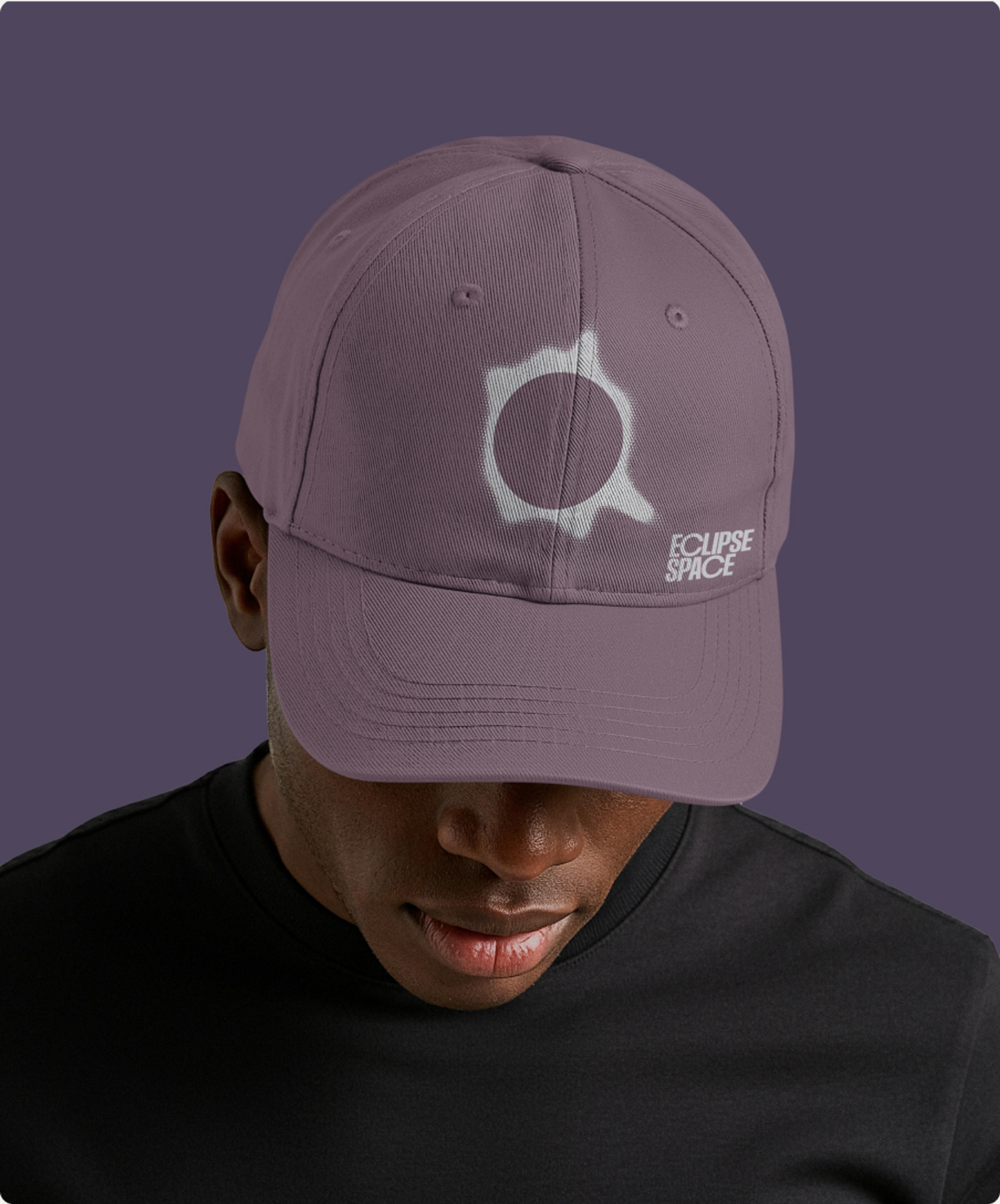
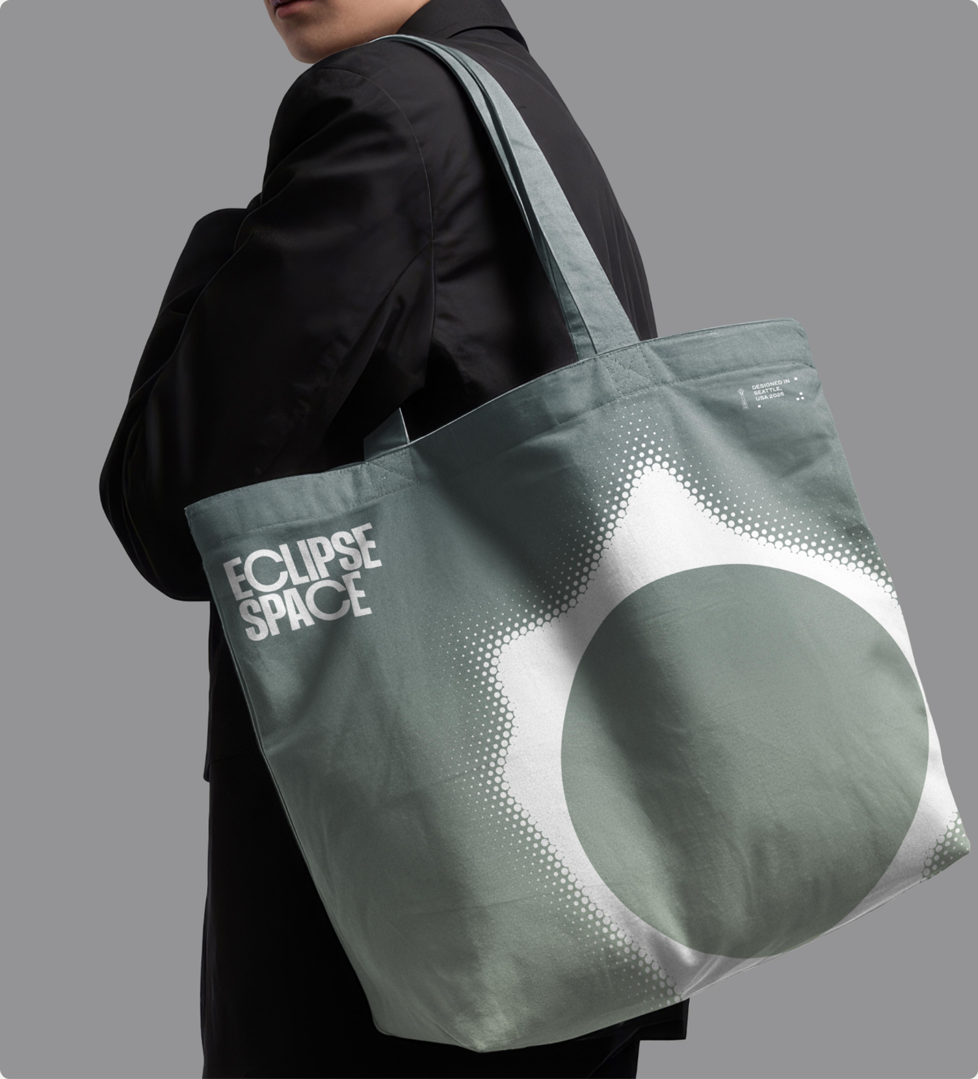
A corona. The part of the sun you only see with the naked eye during a full eclipse. Given the company’s name, there's a directness to it that made it the obvious mark.
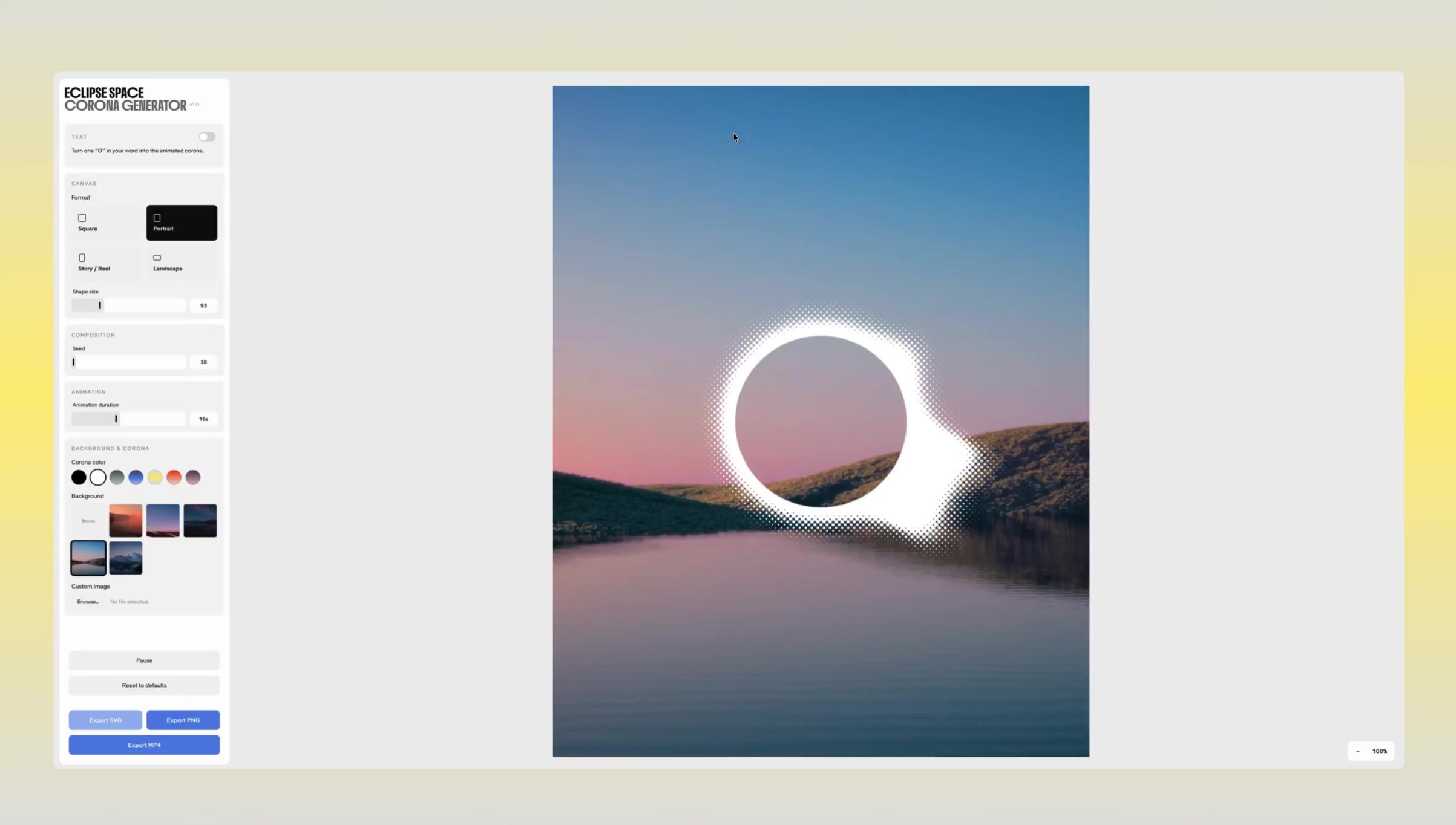
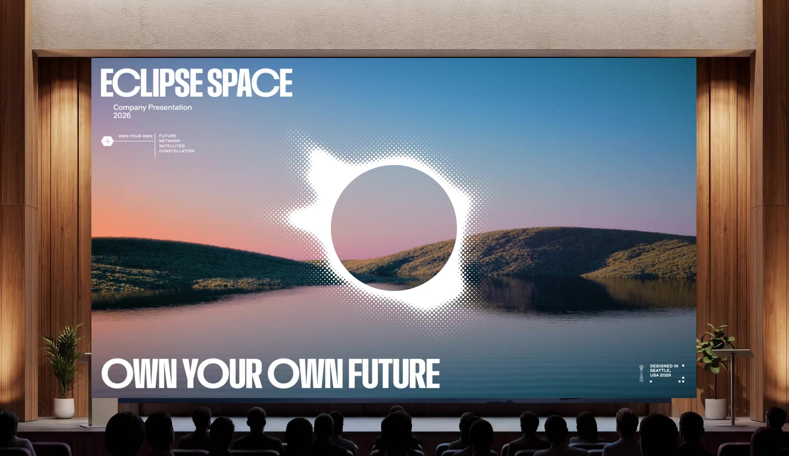
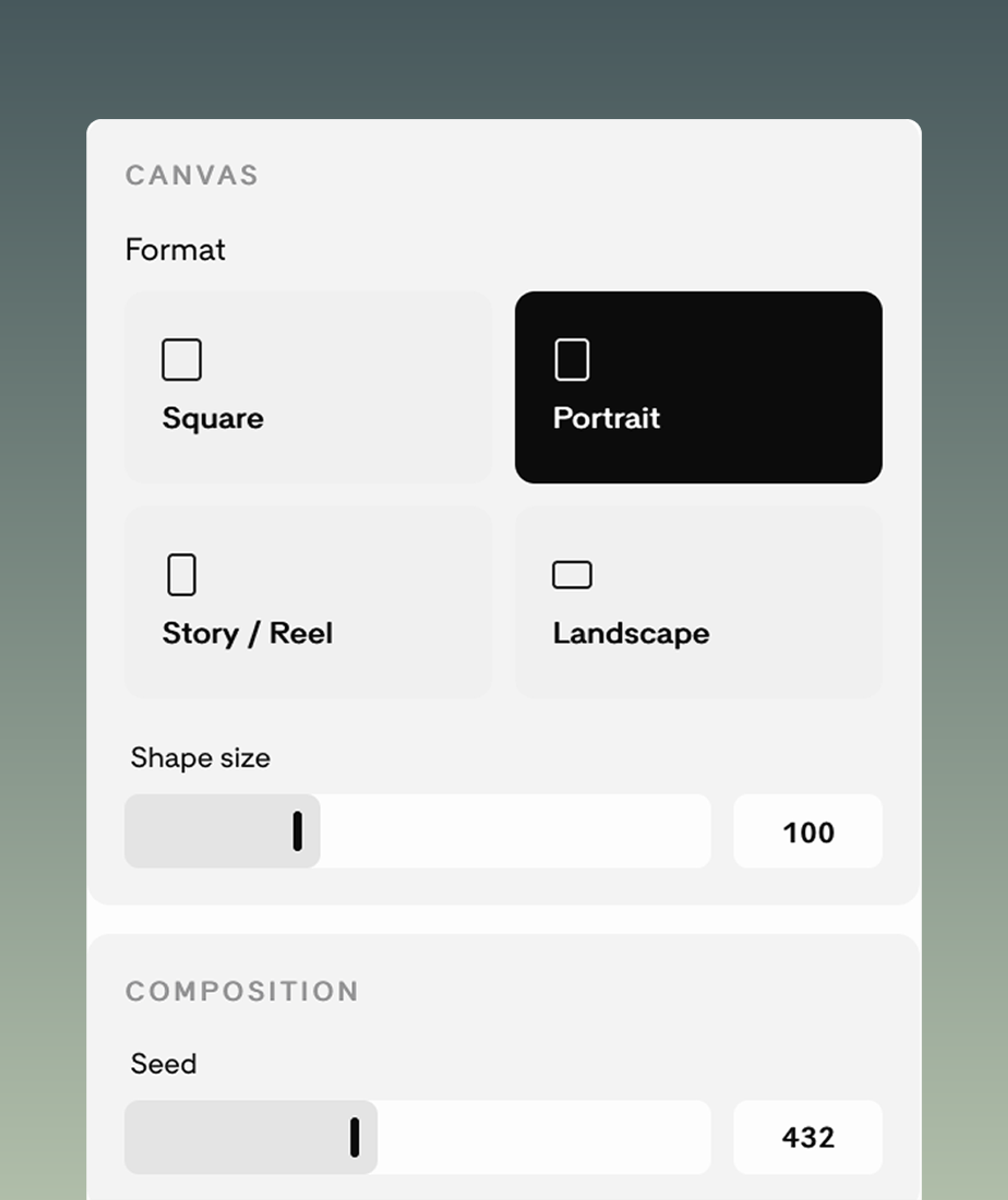
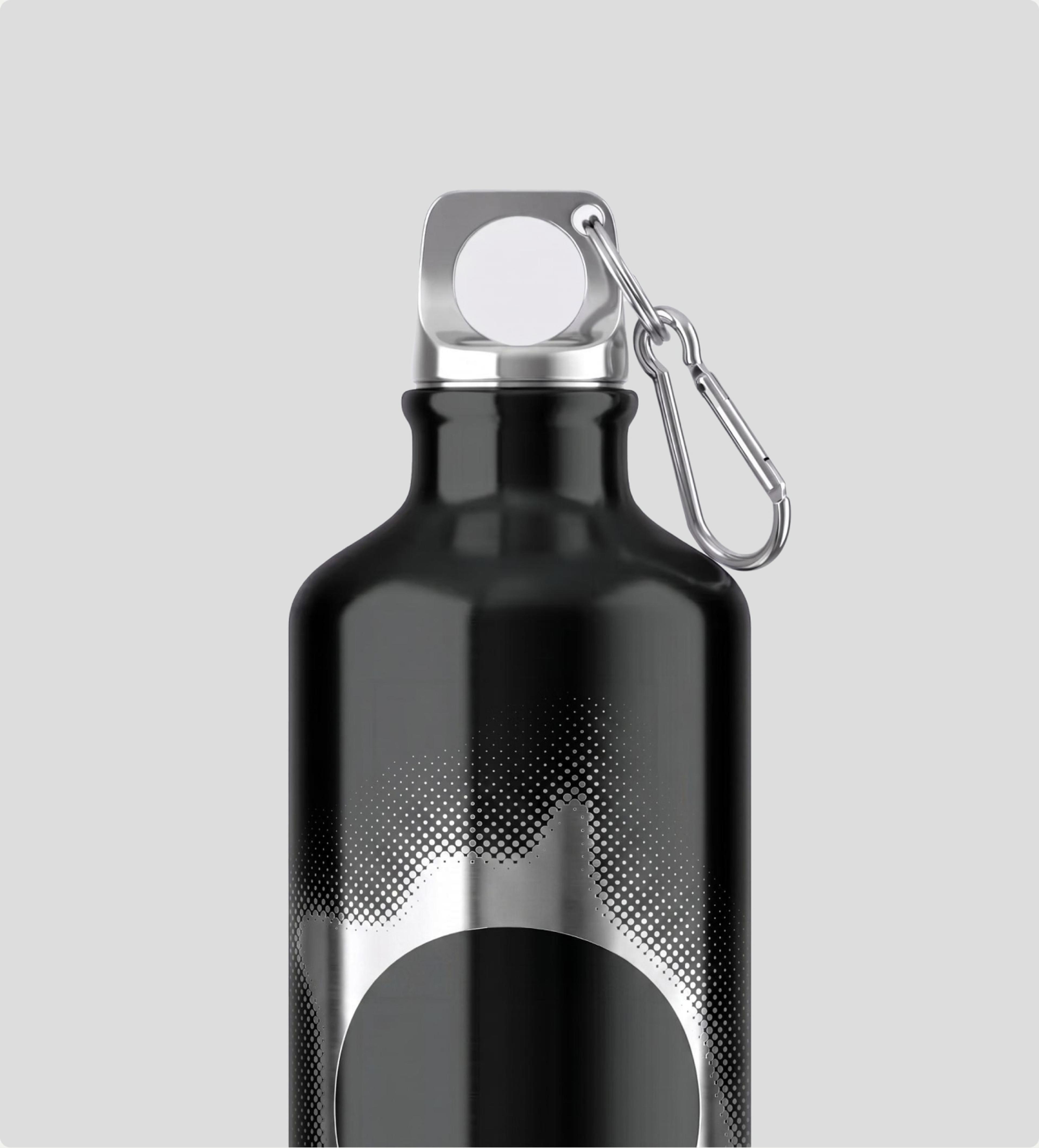
The less obvious part is that we didn’t draw one. We built a tool. The corona generator produces an unlimited run of unique coronas under a fixed set of rules, exports as SVG, PNG, or looping MP4, and can take a custom image behind it. Eclipse can make a new one for every application and never repeat themselves, and the mark still reads as theirs every time, because what’s ownable is the rule, not the shape.
Micrographics
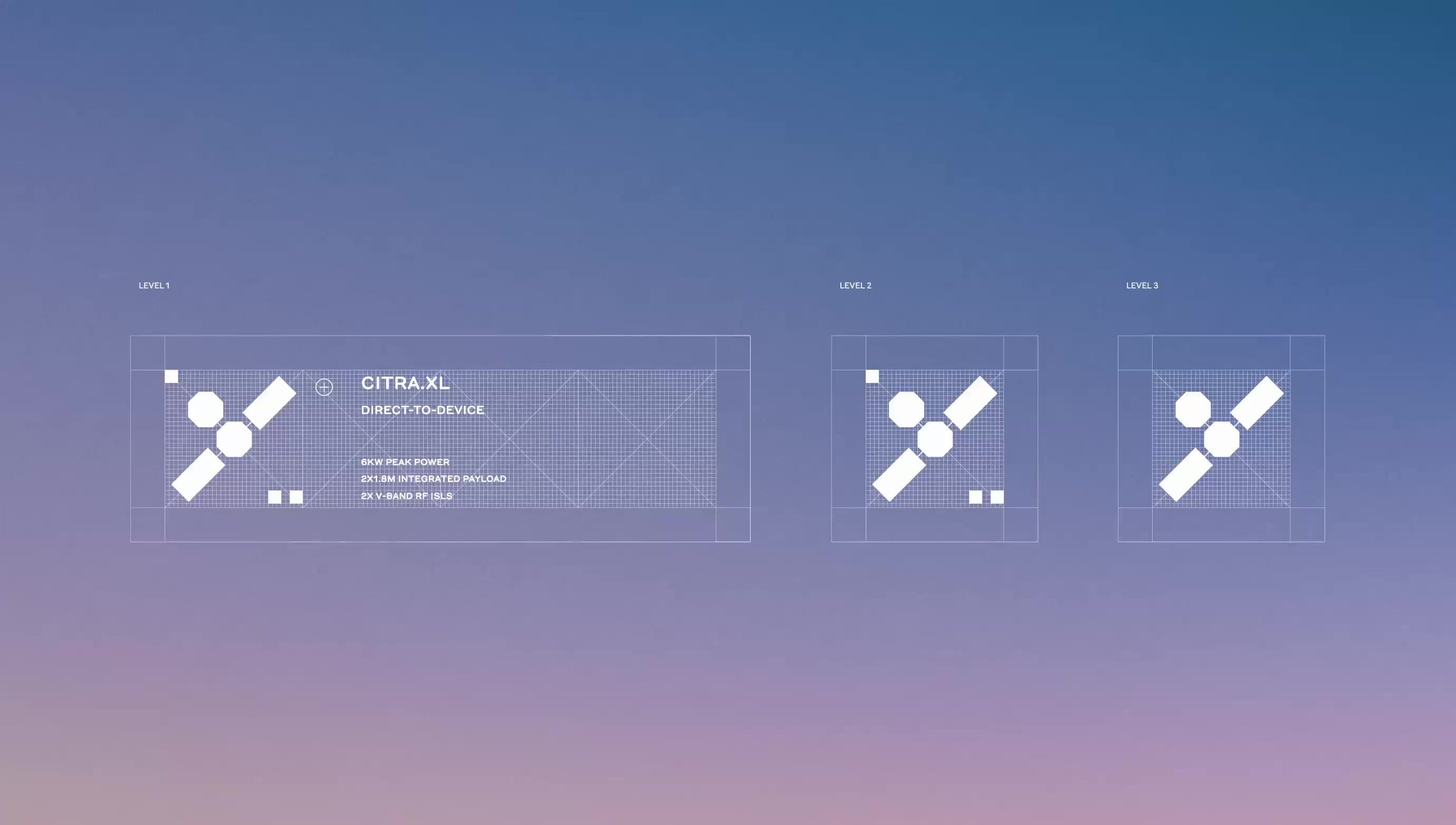
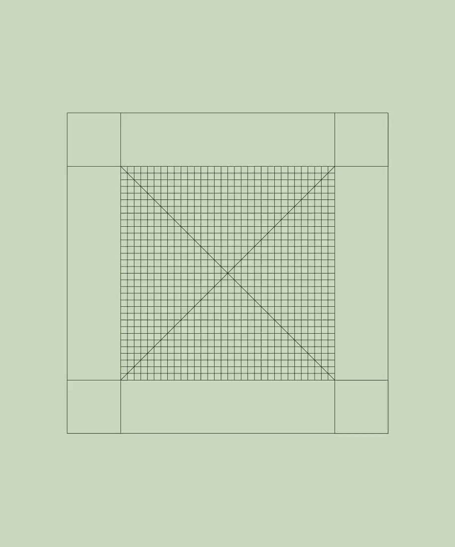
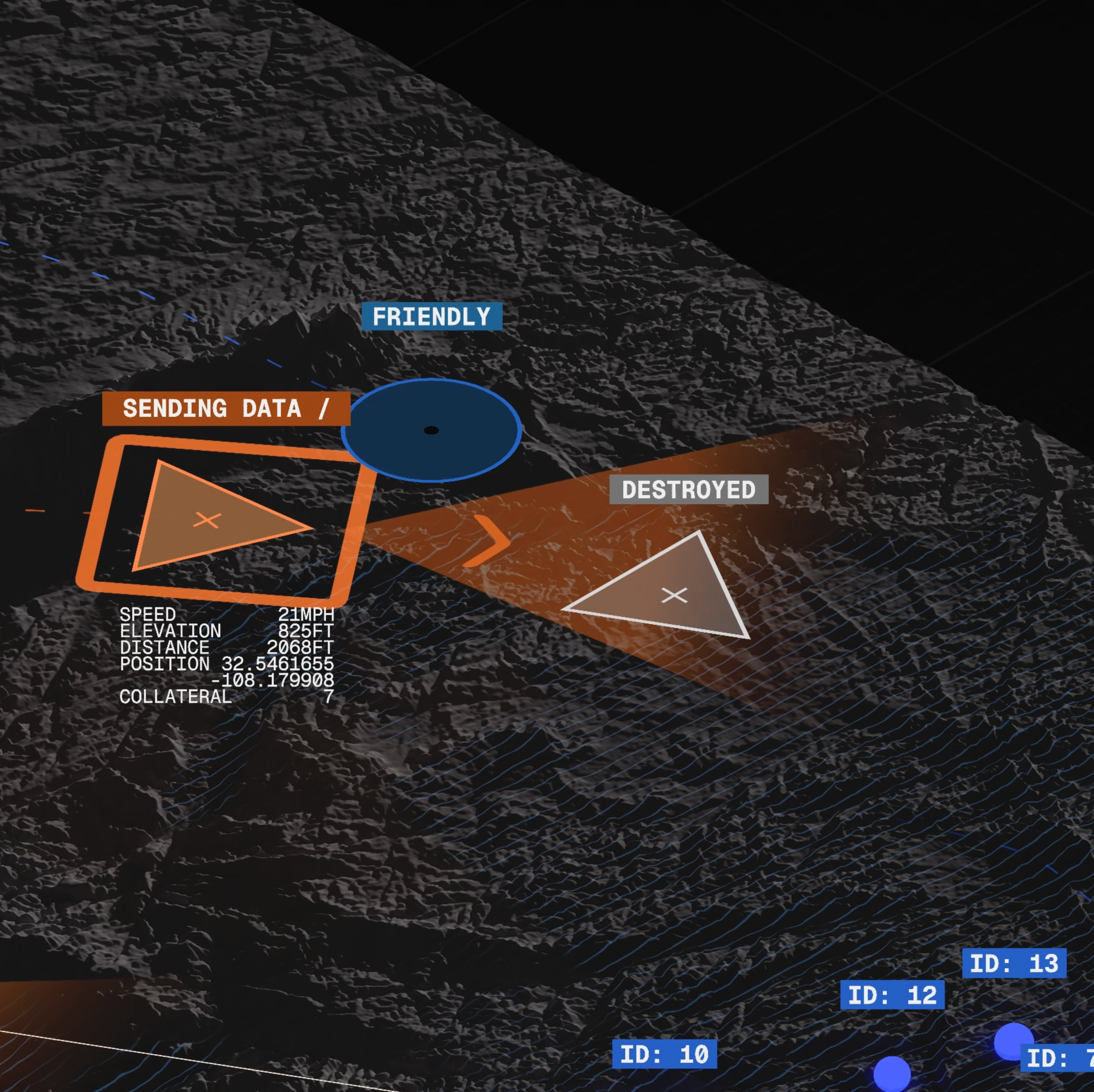
We designed a custom micrographics system with varying degrees of complexity and scalability. The most detailed carry full Gorton labelling and read as a technical diagram; the most minimal are small enough to work as UI elements. A flexible, coherent system that lets a technical company be true to itself.
Imagery
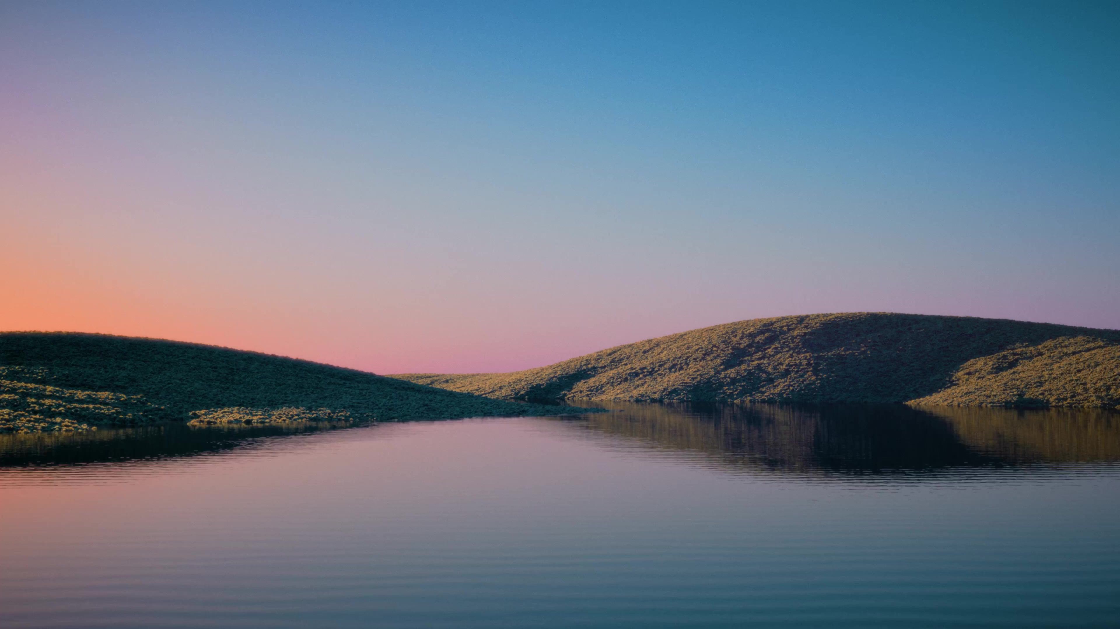
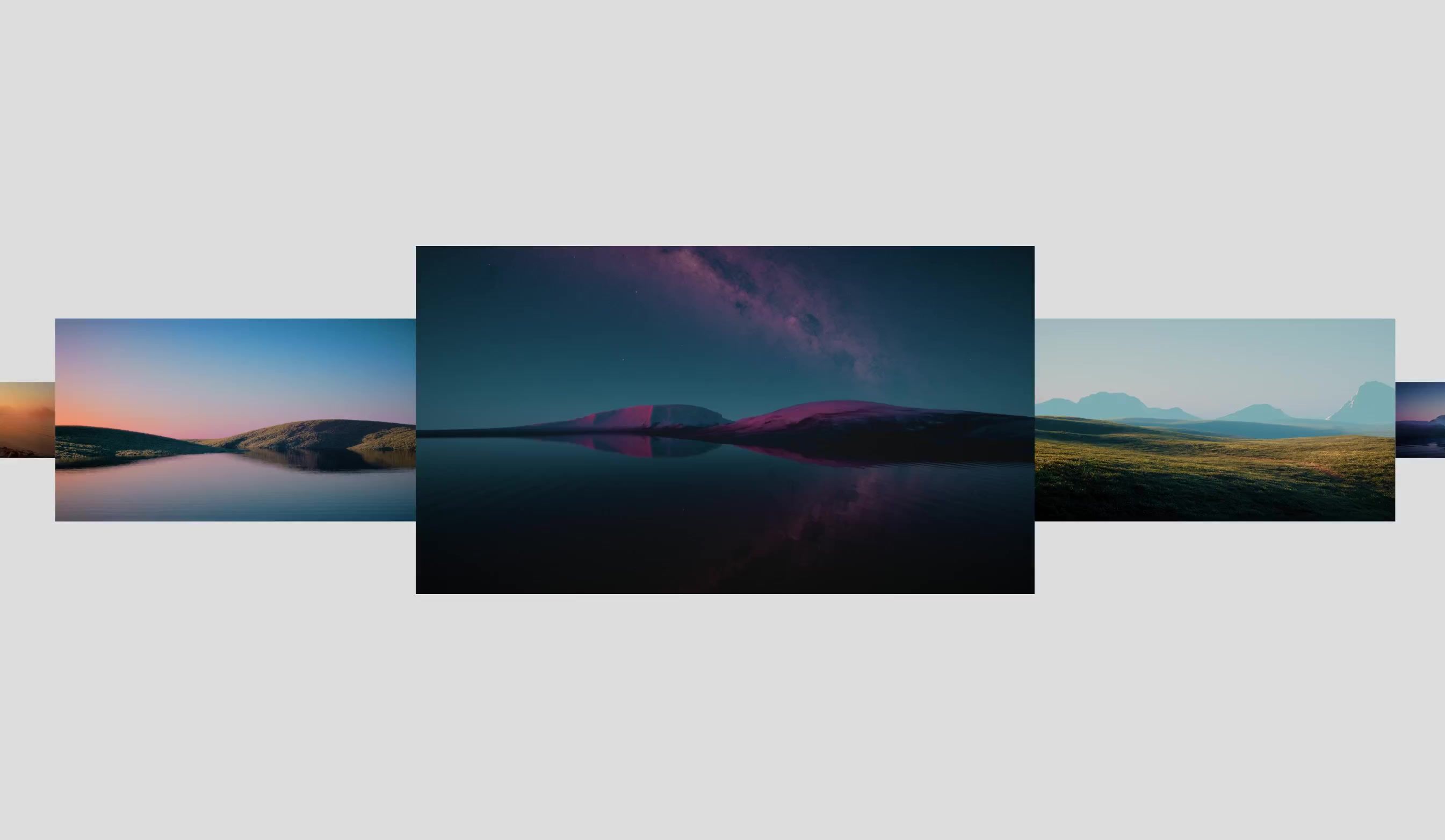
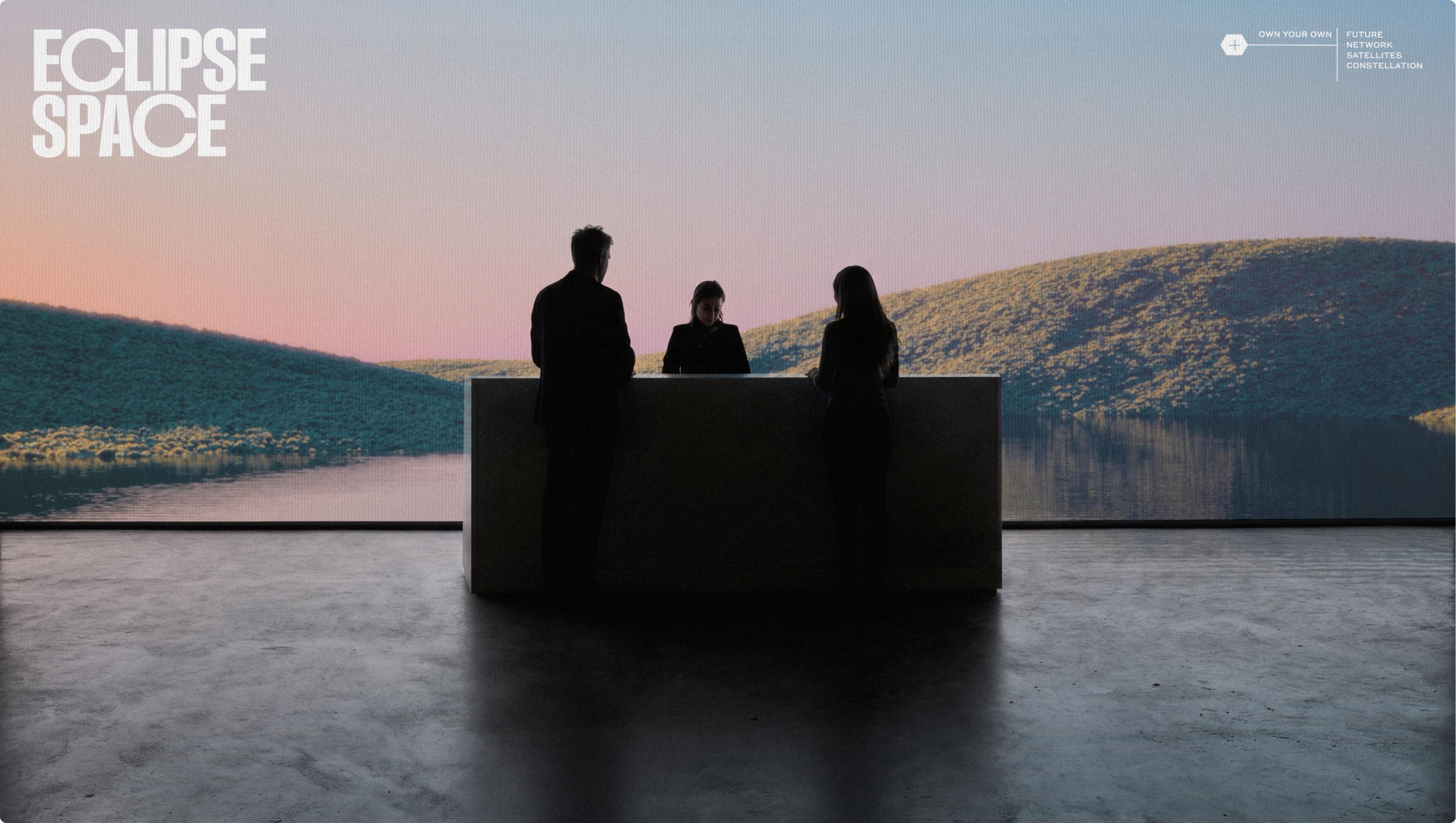
The Eclipse Space visual universe is anchored around a series of magical realism renders: slightly surreal remote landscapes, the places where a satellite network is the difference between connected and not. Generated concept imagery, where realistic scenes are pushed into the brand's own colouring, serve to illustrate use cases without being overly specific.
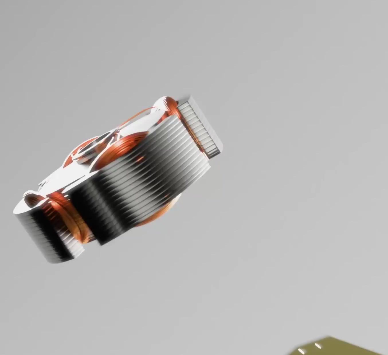
The hardware itself was rendered as true-to-life. When you’re promising the future, hyperrealism is how you make people feel it. So for the satellites themselves, we used 3D to render them so faithfully it could be the real thing.
The Website
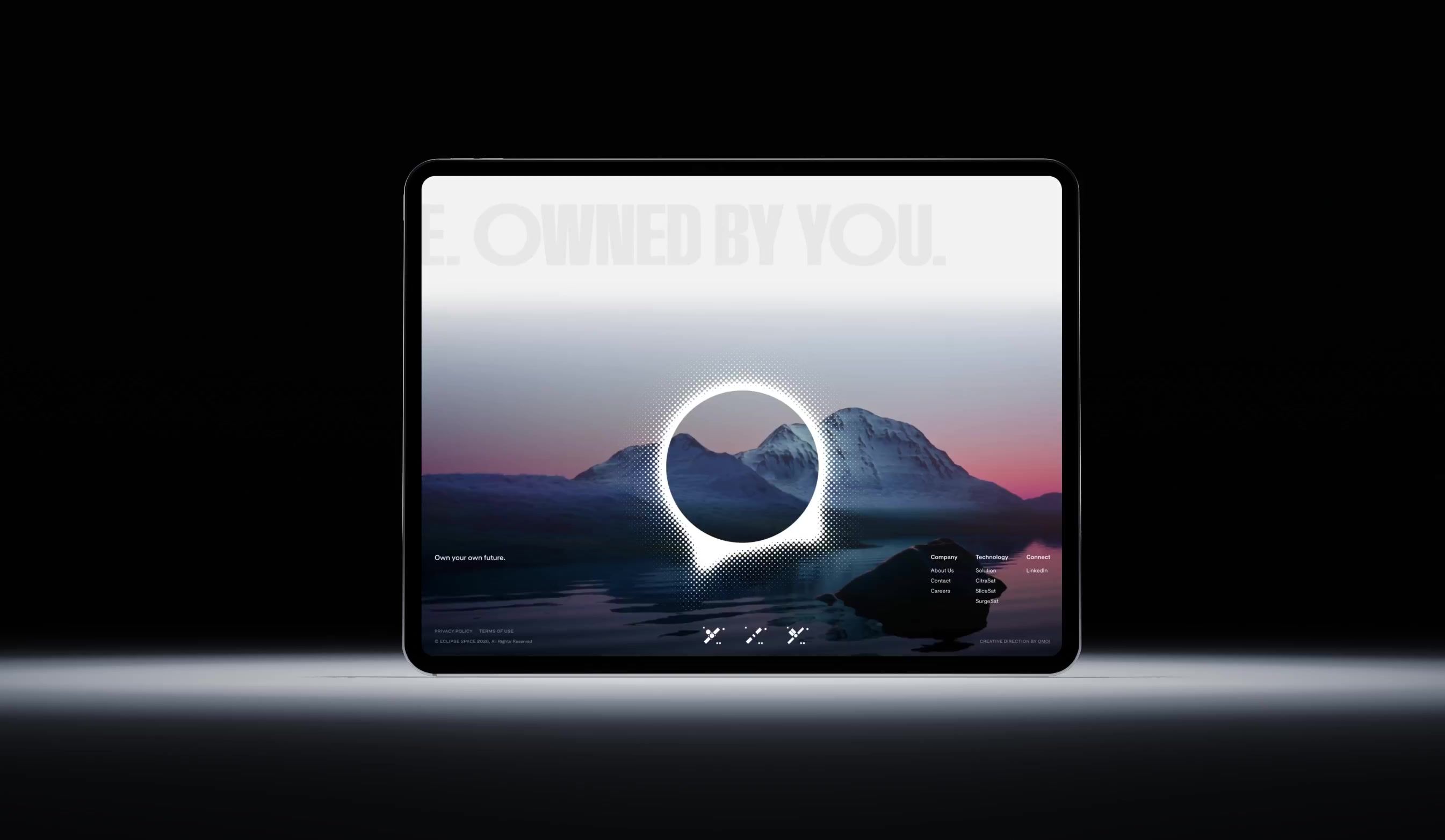
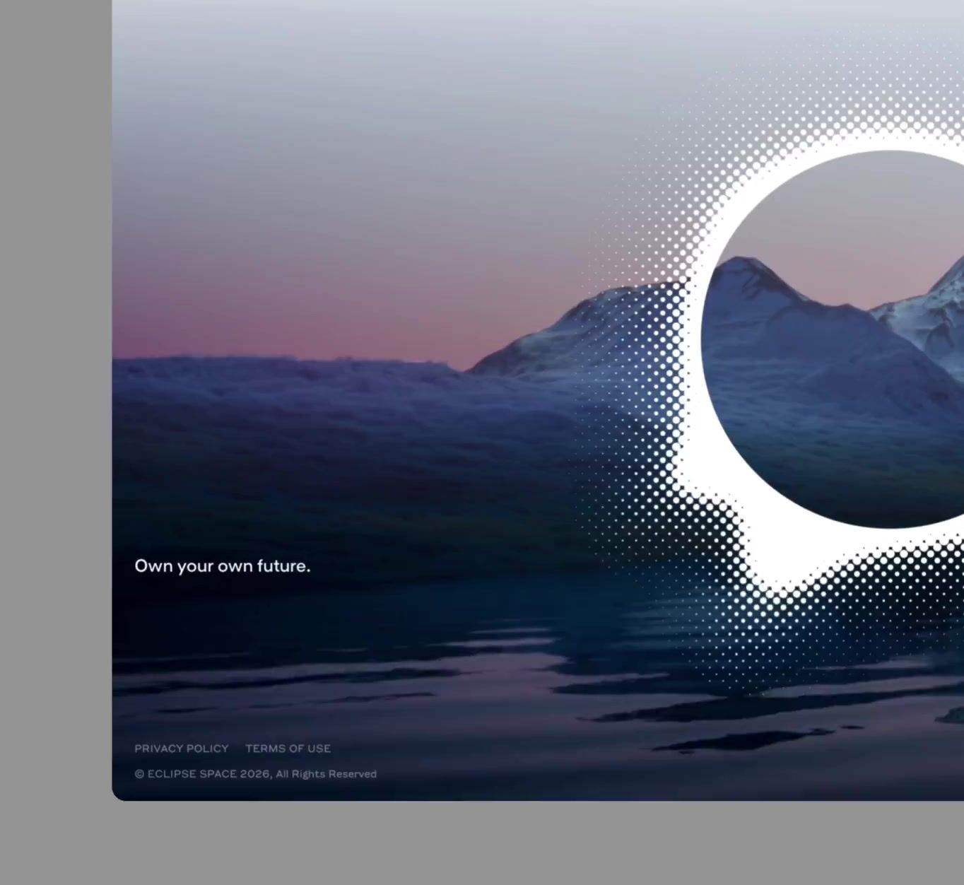
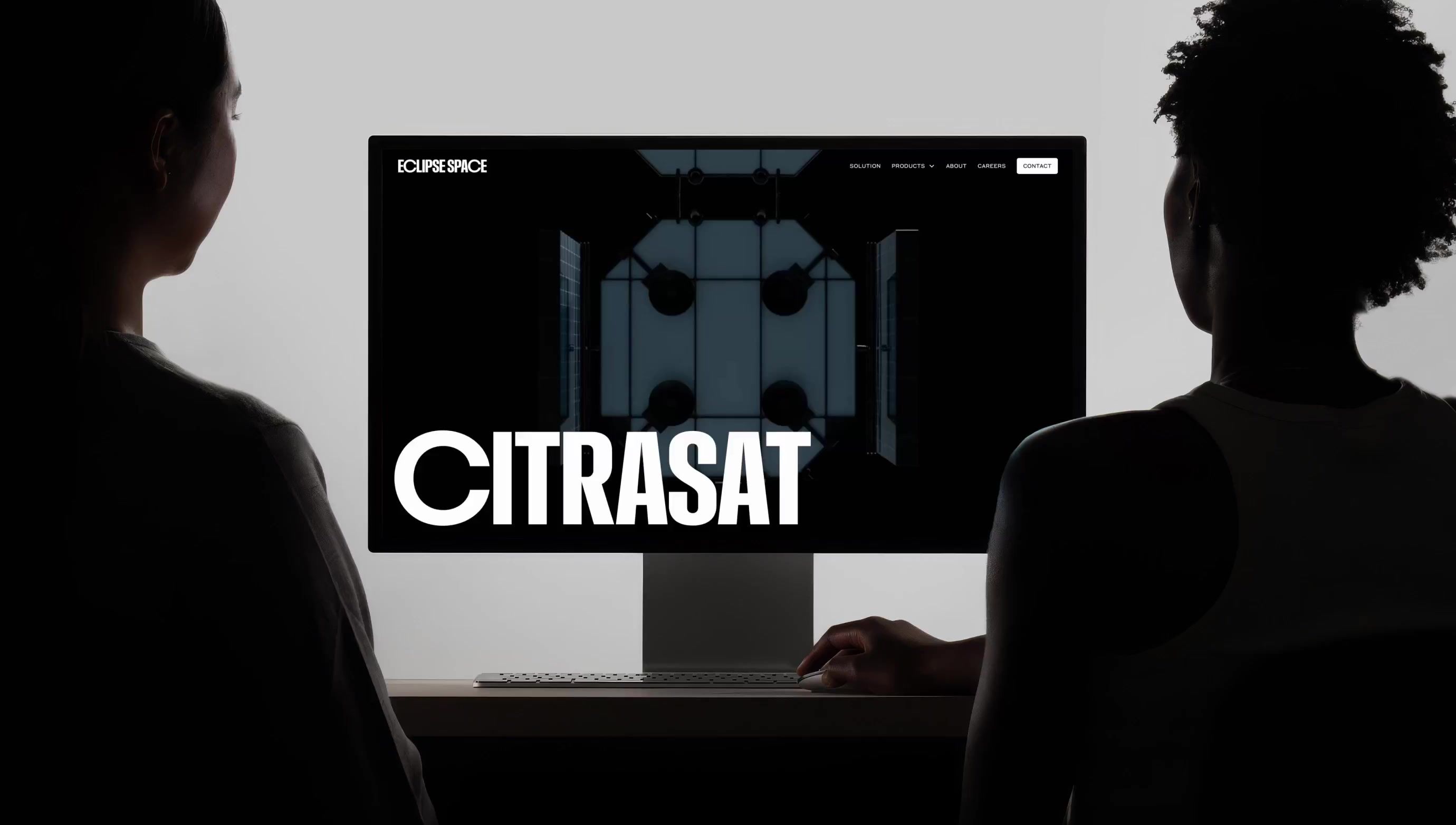
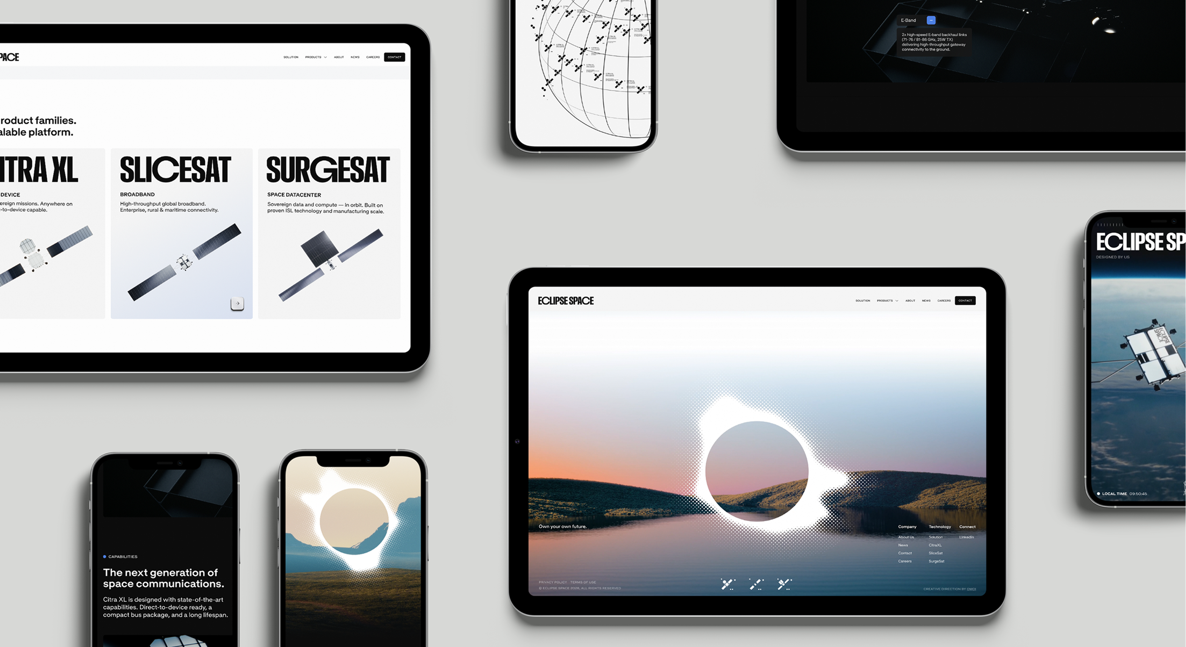
The website architecture is a single idea repeated on every page: you arrive in low Earth orbit, where the satellites are, and you scroll down to Earth, where the people who need them are. Every footer lands in a custom magical realism landscape.
The homepage opens on a globe animation: a vectorized constellation in a single orbital plane, parallaxing as you move, each satellite a micrographic carrying its own serial number. Product pages unfold a hyperrealistic satellite render frame by frame as you scroll, so the hardware assembles itself while you read. Micrographics animate as diagrams rather than decoration. In the footer, the satellites follow your cursor around, a delightful touch from the development team, GRAND st.
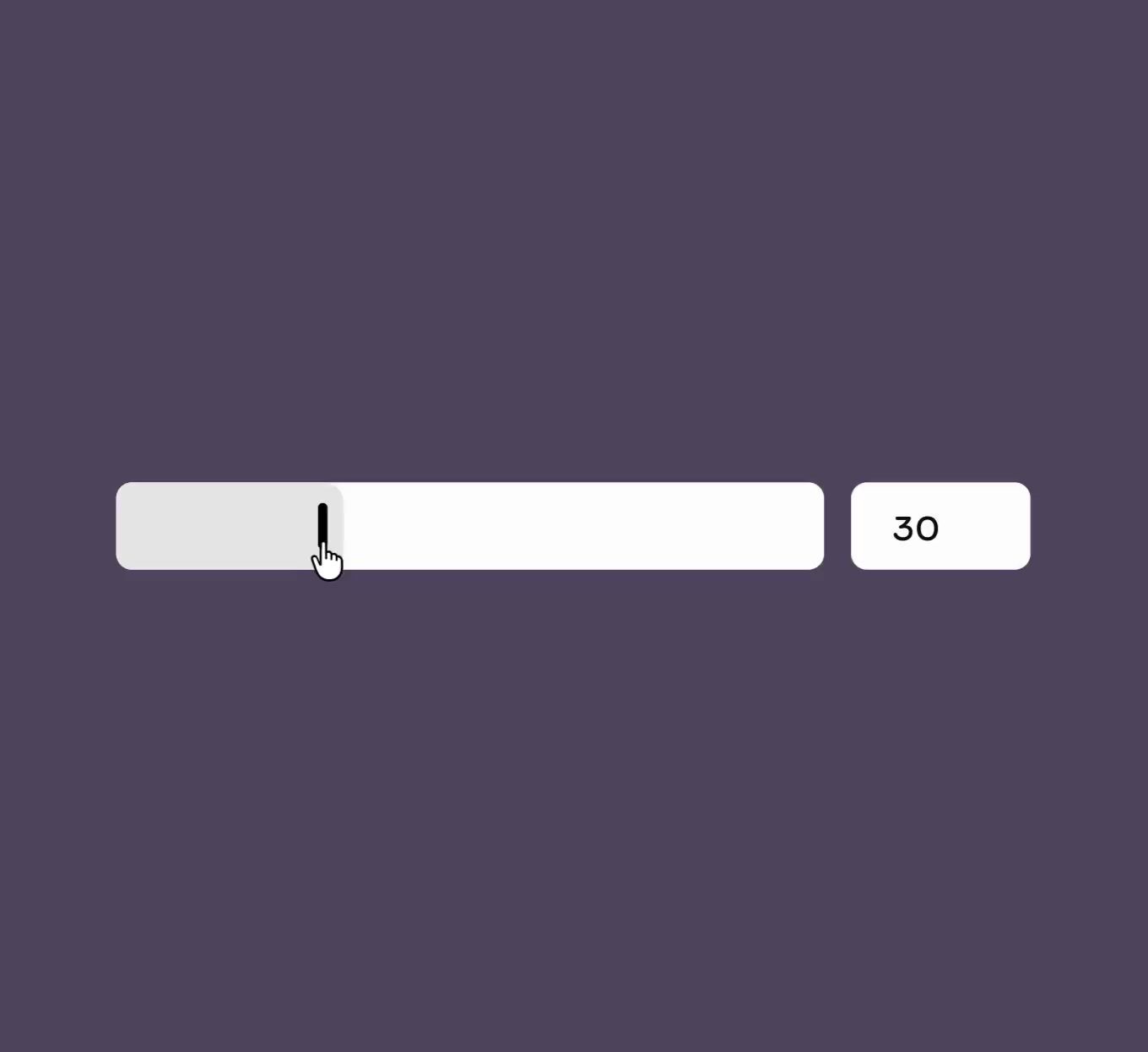
And the buttons. On the Apollo guidance computer keypad the keys are physical objects: milled, chamfered, weighted, made to be pressed correctly by someone wearing gloves at three in the morning. Ours are made of light, but they depress, catch a highlight and settle back the way the originals do.
The Rollout
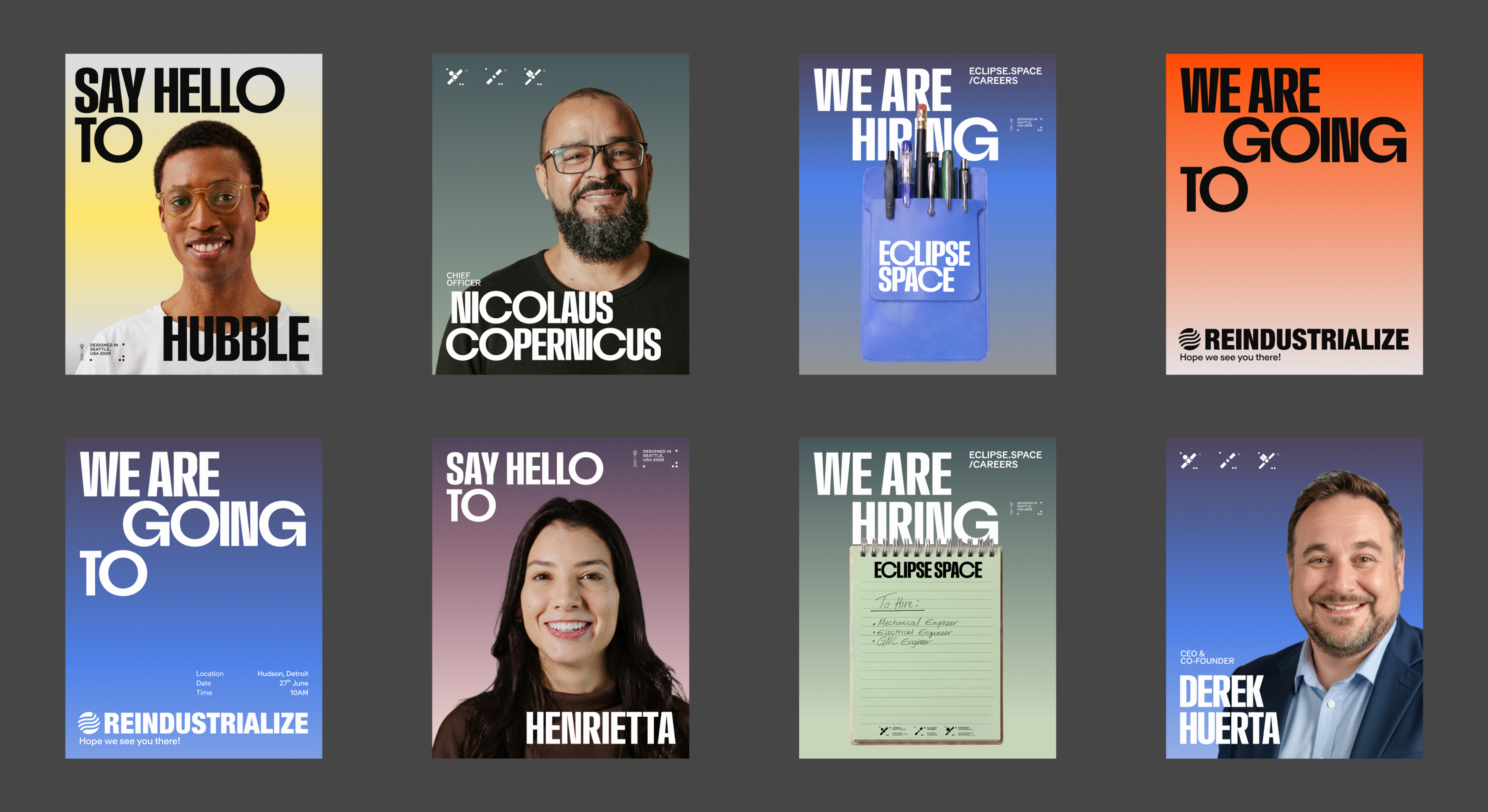
Eclipse came out of stealth with a landing page, a press release and a logo, and stepped into their fundraise with a pitch deck built on the same platform as everything else. Strategy, deck, website and social now run on one vocabulary, one set of references and one idea underneath all of it. The substance was always there. Now there's a brand to match it.

Creative Direction
Carl Versfeld, Monica Kelly
Design Direction
Håkan Ullberg
Graphic Design
Helder Pina, Clara Norborg, Jane Kukharchuk
UX/UI Design
Alba Panyella
Motion Design
Helder Pina, Håkan Ullberg, Jane Kukharchuk
Strategy & Copywriting
Thomas Dawson
3D Design
William Norberg, Hannah Westander
Video Editing & FX
William Norberg, Håkan Ullberg
Project Management
Brittany Whyte
Producer
Naima Lorentzon
Web Development
GRAND st.
Font Foundries
Blaze Type (Custom Font), Grilli Type