Manna


Project Details
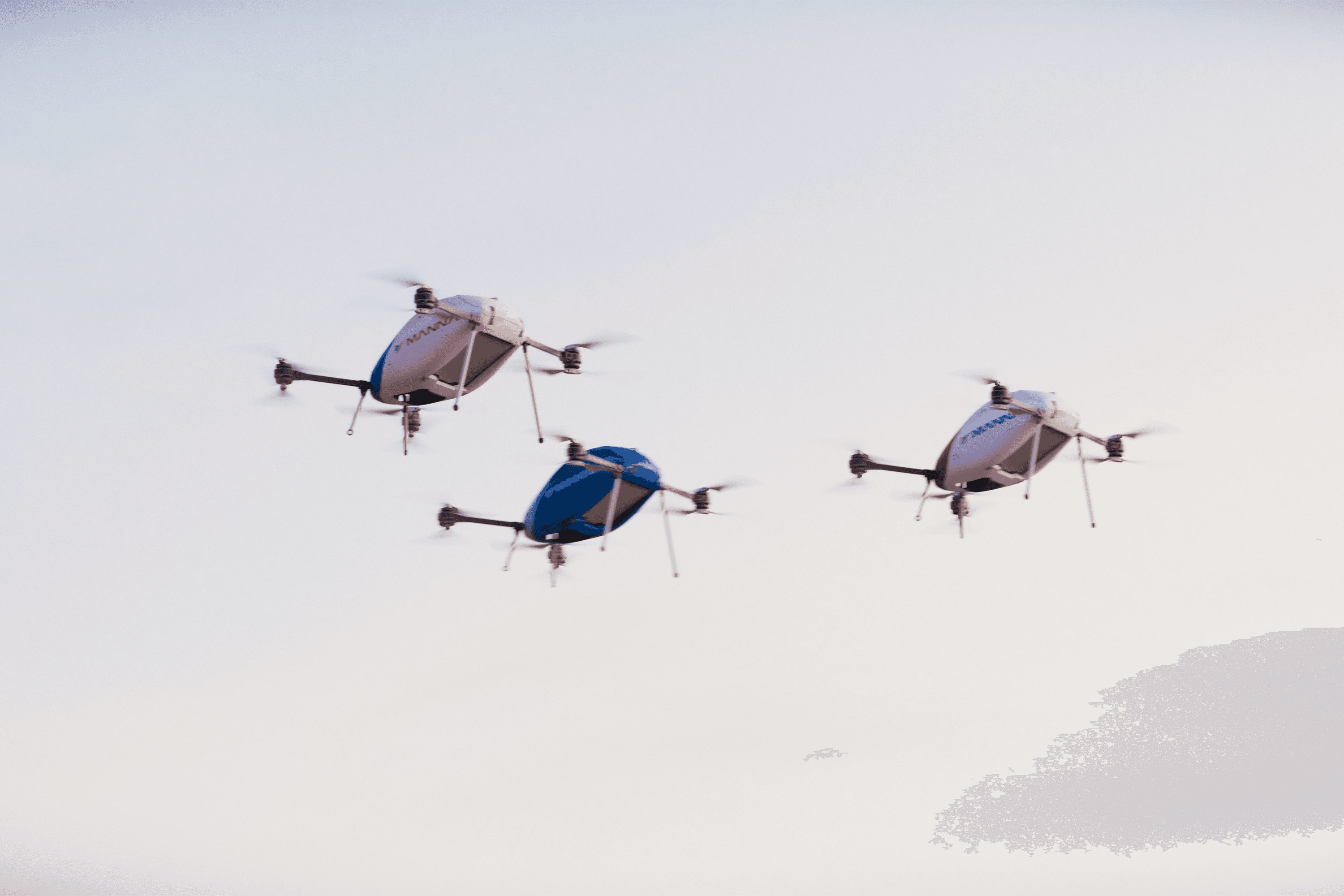
Manna is a Dublin-based aerial delivery company operating live service at scale, completing thousands of real deliveries each week while competitors remain in pilot mode. Ahead of their Series B, they partnered with Omoi to clearly articulate just how far ahead they truly are.
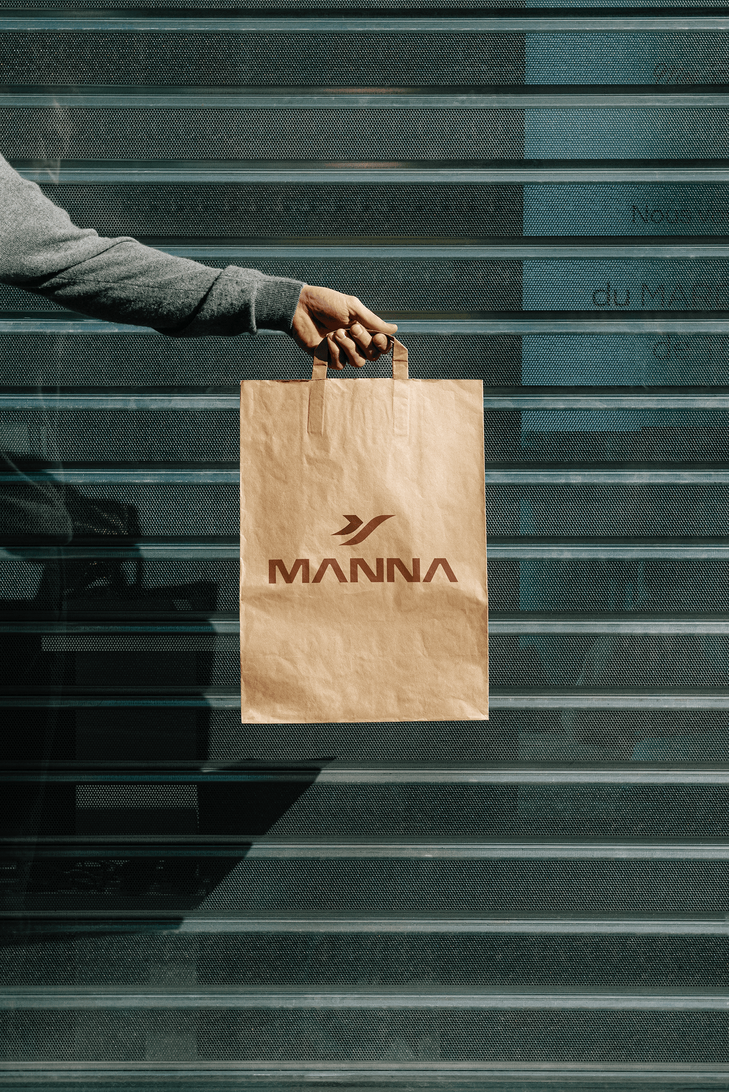
Omoi worked with the team to develop an investor-facing brand system, narrative, and pitch materials, supported by a refreshed visual identity, custom 3D content, photography, and film.
Anchored by the platform “The Future is in Flight,” the work reframes Manna as a proven infrastructure company, positioning them as the most advanced aerial delivery operator in the world.